
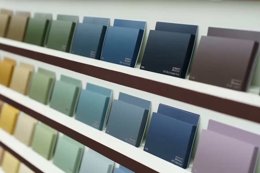
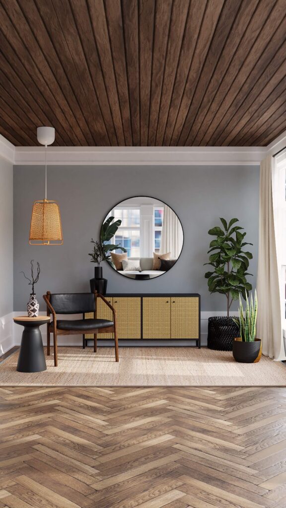
Choosing paint colours is easier when it is treated as part of the renovation rather than a final decorating guess. Flooring, counters, cabinetry, tile, daylight, artificial lighting, and sightlines all change how a colour appears. The best palette connects those fixed elements and still feels right at different times of day.
Start With the Elements That Will Not Change
Paint offers thousands of options; stone, tile, wood, and upholstery do not. Select colour after the durable finishes are known.
Collect physical samples of:
- flooring and area rugs;
- countertops and backsplash;
- cabinet and vanity finishes;
- fireplace stone or brick;
- window coverings;
- large furniture that will remain.
Look for the quiet undertones shared by those materials. A countertop may read grey at first but lean violet, green, blue, or beige beside a true neutral. Paint does not need to match every finish, but its undertone should not make the fixed materials look dirty or accidental.
Learn to Read Undertones
Mass tone is the colour you identify immediately. Undertone is the secondary cast that becomes obvious beside another colour or under different light.
Compare near-neutrals against plain white and against the room’s actual finishes. Put several candidate chips together; the green, pink, yellow, blue, or violet bias becomes easier to see. Do not judge a warm grey, beige, or white from its name.
If the home contains both warm and cool materials, choose a bridge colour that relates to the dominant fixed finish and repeat both temperatures through textiles, art, or wood. Trying to make every surface the same neutral often produces a flat room.
Evaluate Natural Light by Direction and Time
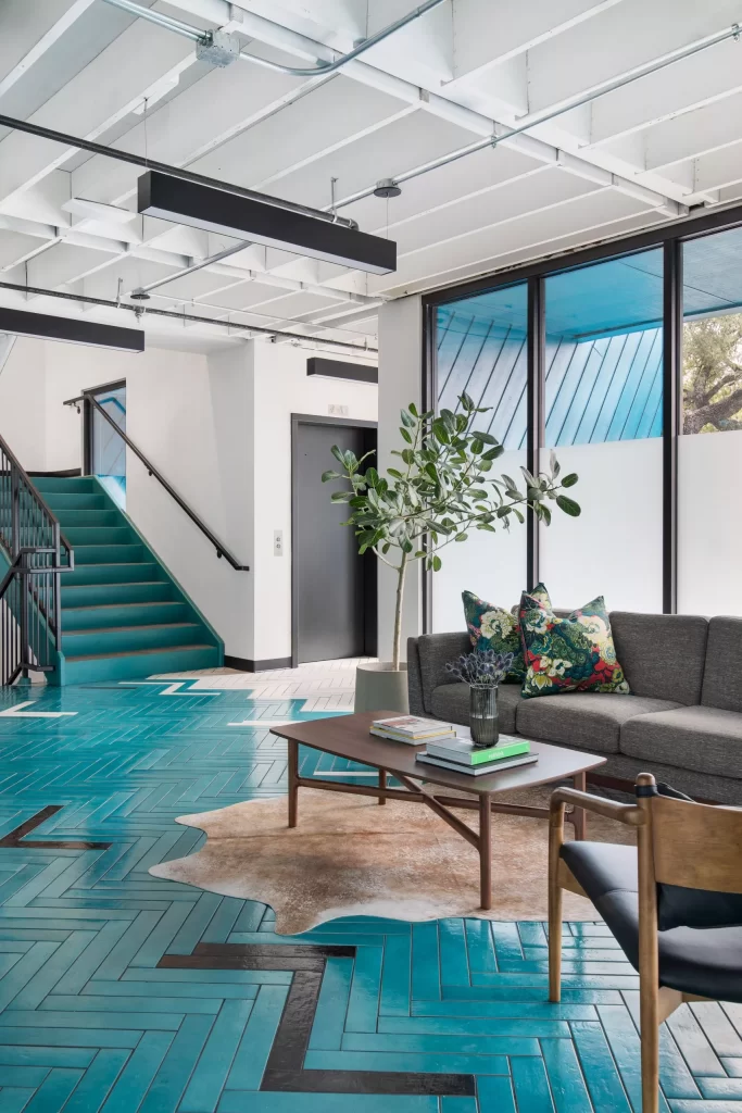
Light changes continuously. North-facing rooms often receive cooler, softer light. South-facing rooms tend to have stronger, warmer light. East-facing rooms are brightest in the morning, while west-facing rooms become warmer later in the day. Trees, neighbouring buildings, window coatings, and overhangs can change those patterns.
View each sample:
- in morning, midday, and evening light;
- with the room’s artificial lighting on;
- beside the floor, trim, and cabinetry;
- on more than one wall;
- in the corners as well as near the window.
A colour that looks balanced beside a bright window can become heavy on the opposite wall.
Coordinate Artificial Lighting
Lamp colour temperature and colour-rendering quality affect paint. Mixed lamps can make one wall look warm and another cool. Select lighting and paint together, and replace inconsistent lamps before final approval.
Use the type of light the room will have after the renovation. Bright work lighting in a kitchen reveals colour differently from warm dimmed light in a family room. Gloss level also changes reflection: higher sheens highlight texture and imperfections, while flatter finishes scatter light more softly.
Build a Whole-Home Colour Flow
Open sightlines need a relationship, not necessarily one colour. Choose a small core palette and vary depth or emphasis from room to room.
A practical sequence is:
- select one main neutral for connected circulation and open areas;
- choose trim and ceiling colours that work with it;
- add restrained room colours that share an undertone or level of softness;
- repeat accent colours in small amounts through adjoining spaces.
Stand at the front door, main hall, and each room threshold. If several colours are visible at once, they should feel intentional together. Use architectural breaks—inside corners, doors, openings, or changes in ceiling plane—for transitions rather than ending colour in the middle of a continuous surface.
Use Warm, Cool, and Neutral Colours Deliberately
Warm colours can make a large or low-light room feel inviting, but saturated warm tones may become intense under evening lamps. Cool colours can feel calm and spacious, but a cool grey in a dim north-facing basement may look dull.
Neutrals are not automatically safe. Warm white, greige, taupe, grey, cream, and putty each carry undertones. Choose the neutral that supports the fixed finishes and desired atmosphere, not the one that is currently popular.
Small rooms do not have to be white. A deeper colour can create a coherent, enveloping effect when trim, lighting, and furnishings support it. Light colours reflect more light, but they cannot compensate for inadequate illumination.
Choose Trim, Ceiling, and Door Colours as Part of the Palette
Pure white can make warm walls look yellow or make aged fixed finishes look dingy. An off-white may integrate better. Test trim colour beside cabinets, tile, windows, and wall paint.
Matching ceiling and wall colour can reduce visual breaks in a small or irregular room; a lighter ceiling can increase perceived brightness. Interior doors can match trim for continuity or use a deliberate accent, but repeated door styles should be treated consistently across connected areas.
Confirm sheen as well as colour. Walls, trim, doors, and ceilings have different durability and reflection needs. In bathrooms, kitchens, and high-traffic areas, substrate preparation and a suitable coating system matter more than choosing the shiniest finish.
Test Large Samples in the Actual Room
Tiny chips are for narrowing the list, not final approval. Apply candidate colours to large movable sample boards or properly prepared wall areas. Use the intended number of coats and allow the sample to dry fully.
Move boards between walls without placing colours directly against one another, which can distort perception. Leave a visual gap or neutral border. Label the brand, colour name, code, product, and sheen so the final specification is unambiguous.
Sample materials and test applications add a small project cost that should be confirmed before purchase, but they are far less disruptive than repainting a finished room.
Use Accent Colours Where Architecture Supports Them
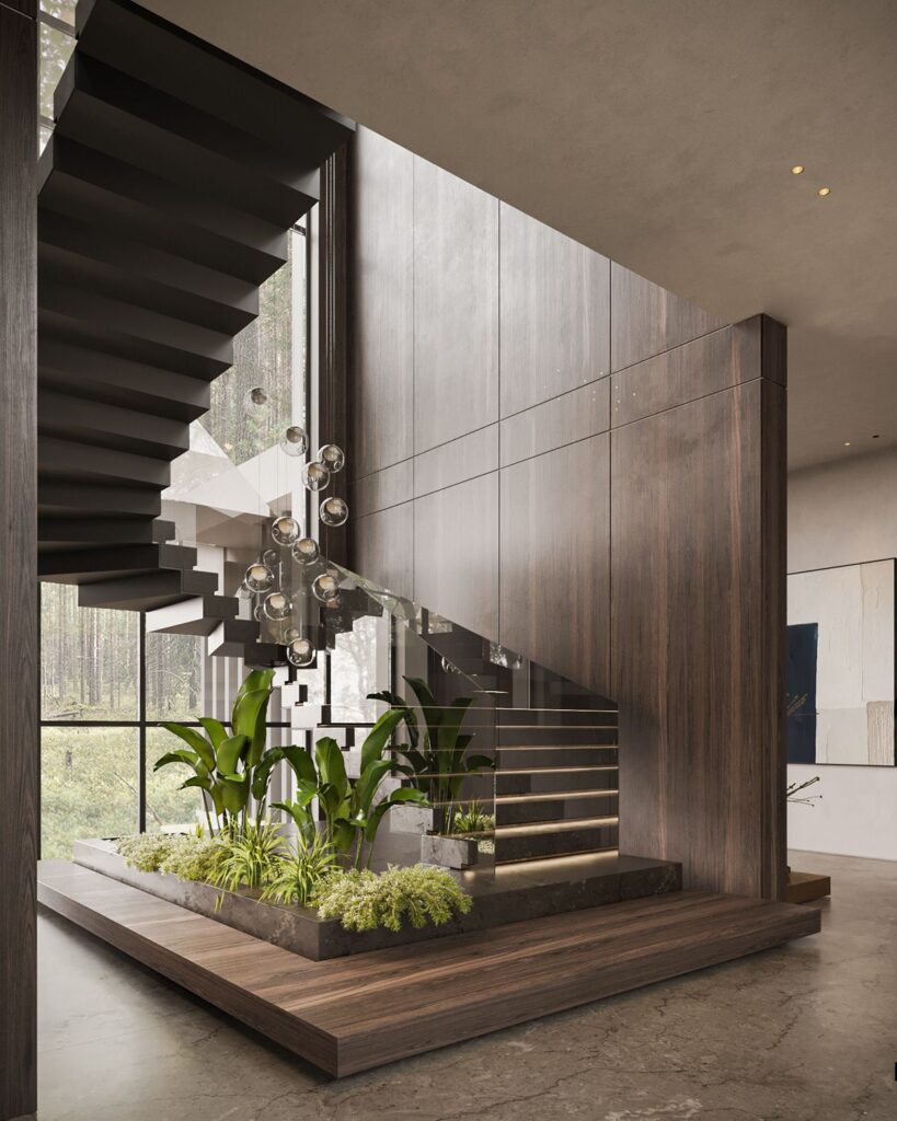
An accent works best when it emphasizes a real focal point: a fireplace, headboard wall, built-in, reading nook, or end of a sightline. A random dark rectangle can make the room feel fragmented.
Before choosing an accent wall, ask whether art, millwork, lighting, or texture would create a better focal point. Keep large fixed surfaces adaptable and use accessories for colours you may want to change more often.
Avoid Common Colour-Selection Mistakes
Do not:
- choose paint from a phone or monitor alone;
- select colour before flooring and cabinetry are finalized;
- ignore undertones in stone and wood;
- test only beside the brightest window;
- use several unrelated whites in one sightline;
- assume a trendy neutral works in every exposure;
- approve colour without the final lighting;
- forget to record the exact product and sheen.
When in doubt, simplify the palette and improve the lighting. More colours do not create more character if the undertones compete.
Conclusion
A reliable paint palette begins with fixed finishes, undertones, real light, and whole-home sightlines. Narrow the options, coordinate the lighting, test large samples in place, and specify colour and sheen together. GMC Construction can integrate paint selections with cabinetry, flooring, tile, lighting, and trim so the final rooms read as one renovation rather than separate decisions.